AMANDA GOLDWASSER
Brand builder.

LOGO // The resort's location (Havatzelet HaSharon) translates to "Lily of the Valley," thus the 6 petaled lily in the center of the symbol. Its outer ring consists of 18 petals, a number that symbolizes life.
NAMING // When talking to one of the project leads, he described his vision for this wellness resort as a place that makes people thankful for being alive. When brainstorming later, I thought of a Hebrew prayer in which the first words translate to "I give thanks." I adapted the transliteration of the title—and so a name was born.
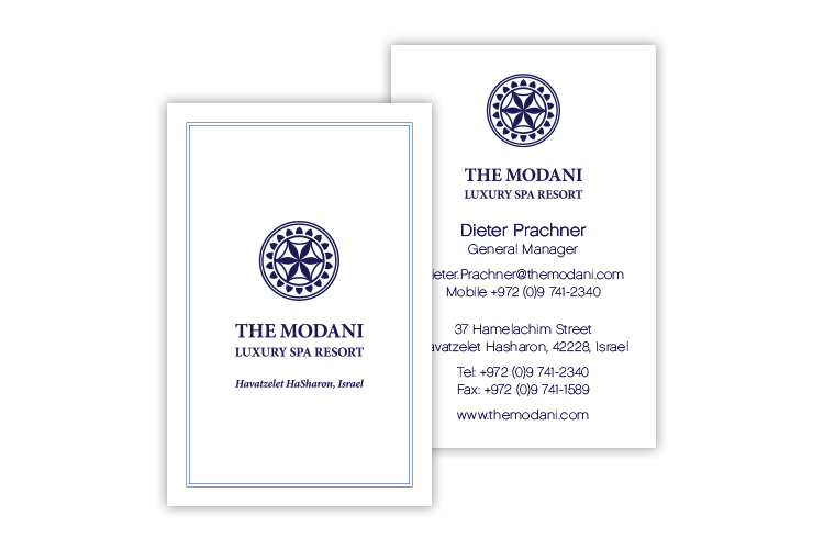
BUSINESS CARDS // A vertical layout helps put the unique symbol front and center.
