• STRATEGY
  • DESIGN
  • ME
  • GET IN TOUCH

AMANDA GOLDWASSER

Brand builder.

  • STRATEGY
  • DESIGN
  • ME
  • GET IN TOUCH
1.HPR.png

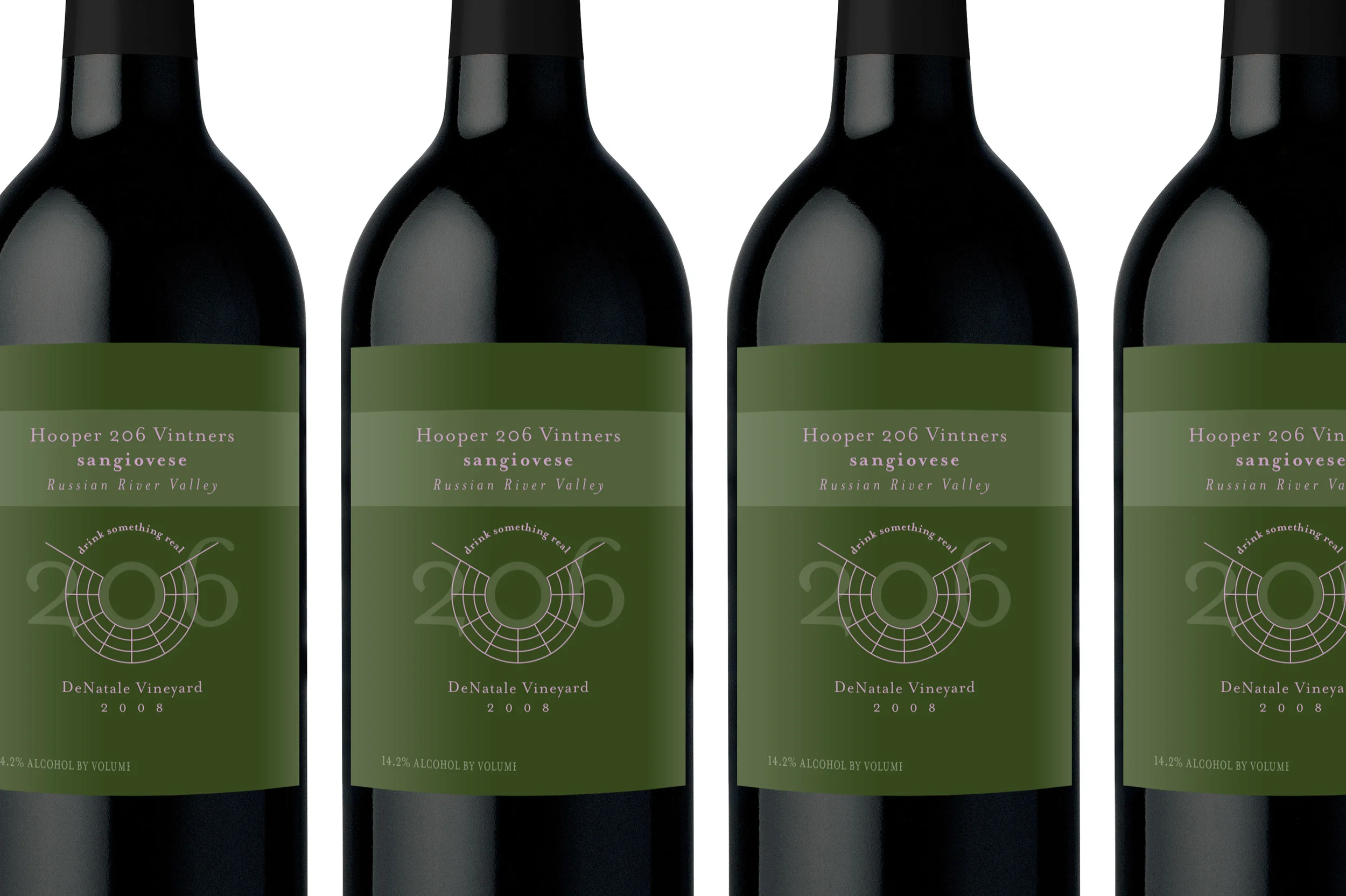
LOGO // This winemaker believes that wine is a form of "radical self expression." Their logo is another form of self expression: 206 is the number of the winemakers' college dorm room, the symbol radiating from the zero is a schematic of the Burning Man festival, and their tagline, 'drink something real' is their ultimate charge to their consumers.
 

2.HPR.jpg

PACKAGE DESIGN // For their first release, I chose a color that references the lush color of Russian River Valley and paired it with a pastel violet to represent the grape.
 

PACKAGE DESIGN // Color, contrast, and elegant typography tie together the yearly Pinot Noir released under the Hooper 206 label.
 

PACKAGE DESIGN // This special edition Merlot incorporates an original illustration by the wife of one of Hooper 206's head winemakers.


© 2017, Amanda Goldwasser. All rights reserved.